Maximizing Conversion Rates: The Impact of Visuals on WordPress Landing Pages

If you’re running a WordPress site and want to turn visitors into customers, improving your landing page design is key.
From hero images to product shots, visuals make or break first impressions. They communicate your brand’s personality while clarifying your offer’s details. Confident visuals convert window shoppers into loyal customers. On the flip side, sloppy or generic visuals scream ”unprofessional,” killing trust and tanking conversion rates.
However, designing eye-catching WordPress landing pages with limited resources might seem a bit intimidating. But stellar visuals boost conversions and ROI, so they’re non-negotiable.
So, how do you manage it?
This guide delivers actionable tips for upgrading the visuals on your WordPress landing pages without the need for pricey designers. We’ll arm you with pro-level tactics to leverage visuals on any budget. Plus, we’ll showcase their conversion-boosting power with real-world examples.
1. Explaining Your Offer through Video
Videos can be the best salespeople on WordPress landing pages.
Explainer videos are particularly effective because they combine visual and auditory elements to clarify your offers quickly and engagingly.
According to a recent study by Wyzowl, 91% of people have watched an explainer video to better understand a product or service, and 84% of consumers say they’ve been convinced to make a purchase after watching a brand’s video. This validates the impact videos can have on conversion rates.
Here’s how to create an effective explainer video:
- Ditch the corporate fluff and keep things casual yet authoritative.
- Start with a quick hook summarizing the value proposition.
- Use simple props to illustrate tough concepts.
- Don’t just list features; explain how each solves a relatable customer pain point.
- Keep it concise at 60–90 seconds.
- Close with a clear CTA, driving viewers to the next step.
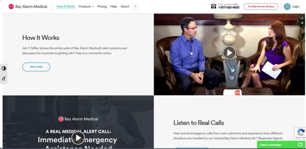
A prime example of this strategy in action is Bay Alarm Medical, which offers medical alert systems. On their ”How Do Our Medical Alert Systems Work?” page, they feature a video where a knowledgeable expert explains the product’s functions and features.

This approach helps demystify the technology for users and builds trust by providing a transparent look at what customers can expect from their products.
The video effectively communicates the ease of use and reliability of the system (key factors for their target audience), thereby enhancing the likelihood of conversion from your WordPress landing page.
2. Showcasing Your Process with High-Quality Images
Images aren’t just decorative elements. They’re powerful tools that can dramatically enhance user understanding and trust.
Showing your process through high-quality images allows potential customers to visualize exactly what they’re getting, reducing uncertainty and boosting confidence in your services. This visual transparency can be vital in converting interested visitors into paying customers.
Here’s how to visually demonstrate your process by using images on WordPress landing pages:
- Start by selecting images that are sharp, clear, and professionally shot. Each image should serve a specific purpose in illustrating a step of your process, helping to tell the story of how your product or service comes to life.
- It’s important to use real images of your team and facilities rather than stock photos. That adds authenticity and a personal touch to your brand’s narrative.
- Place these images strategically throughout your site, accompanied by brief descriptions to guide the viewer through your process.
- Additionally, make sure these images are optimized for fast loading times to improve the overall user experience.
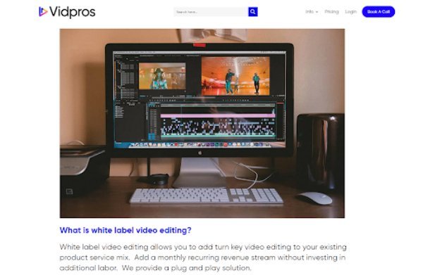
Vidpros, a platform offering on-demand video editing services, exemplifies this approach on their page for white label video services. They display detailed images showing their video-editing process, from shooting raw footage to polishing edits.

Visitors can practically sense the video editors’ deft mastery through artistic B-roll clips, soundproofed editing bays, and top-tier hardware. Each vivid glimpse instills confidence that ordering this service guarantees flawless execution.
This way, they educate potential clients about the value of their services while building a layer of trust that’s essential for attracting and retaining customers.
3. Enhancing Your Features or Benefits with Descriptive Icons
Listing features alone rarely excite visitors into converting. They don’t connect the dots between technical specs and real-life benefits.
That’s where descriptive icons enter the conversion equation. They can be instrumental in communicating complex information quickly and effectively.
These simple yet powerful visuals turn dry bullet points into engaging, easy-to-grasp value props. Better yet, they slash cognitive overload by condensing several details into one punchy symbol.
Here’s how to implement this strategy on your WordPress landing pages:
- Choose icons that are intuitive and directly related to the feature or benefit they represent. Consistency in the style and color of the icons is key to maintaining a professional and cohesive look.
- Make sure each icon is accompanied by a short, clear description to eliminate any ambiguity about what the feature entails. This combination of text and imagery caters to both visual and textual learners, broadening your appeal.
- Additionally, ensure that the icons are optimized for all devices to maintain clarity and functionality across different screen sizes.
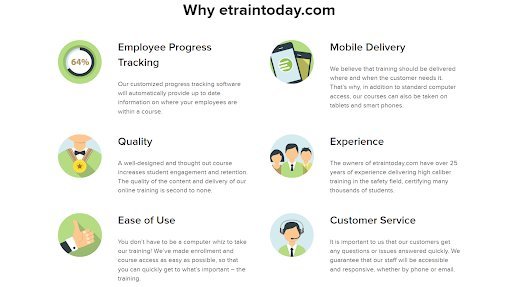
A company that successfully utilizes this approach is eTraining, which provides online workplace safety training. On their “OSHA 40-Hour HAZWOPER Training” course page, they enhance the presentation of their service features and benefits with well-chosen icons.
Each icon is tailored to illustrate concepts like ease of use, employee progress tracking, and quality customer service, making the information more accessible and engaging.

This visual strategy clarifies the specific advantages of their training and helps to set them apart from competitors by making their offers more memorable and understandable.
This smart use of icons transforms standard text into an informative and visually appealing guide, boosting user retention and satisfaction.
4. Featuring Video Testimonials
Testimonials play an important role in building trust and credibility with potential customers. Video testimonials, in particular, bring an added layer of authenticity as viewers can see and hear real people sharing their genuine experiences.
Research reveals that 82% of people say a brand’s video has convinced them to buy a piece of software or app, demonstrating the powerful impact of video as a form of social proof on conversion rates.
Here’s how to leverage the power of video testimonials on WordPress landing pages:
- Choose stories that resonate with your target audience’s needs and challenges.
- Ensure that the testimonials aren’t only genuine but also highlight specific aspects of your service that address common concerns or goals.
- The video quality should be high, with clear audio so that messages are easily understood without distraction.
- Place these videos prominently on your landing pages to catch the attention of potential customers early in their visit.
Alexander Tutoring, an online math and physics tutoring service, nails this strategy on their ”Math Tutoring” landing page. They feature a heartfelt video testimonial from a satisfied parent discussing the significant progress their child has made.

This testimonial showcases the effectiveness of Alexander Tutoring’s approach and emotionally connects with other parents seeking similar outcomes for their children.
This approach effectively utilizes the persuasive power of video testimonials to build trust and encourage engagement. By presenting a real-world success story, you too can enhance your brand’s credibility while meaningfully engaging with prospective clients, making your service a compelling choice.
5. Presenting Data in a Digestible Format
Data can powerfully validate your offers, but only if it’s presented in a way that’s easily understandable. Overwhelming your audience with complex data or cluttered presentations can lead to confusion rather than clarity.
By simplifying the data on your WordPress landing pages into a digestible format, such as infographics, you can effectively communicate key insights and enhance the retention of the information, making your arguments more convincing and memorable.
Here’s how to get this right:
- Focus on clarity and simplicity in your data presentation. Use clean, engaging visuals that highlight the most important data points without overloading the viewer.
- Colors, charts, and icons should help to differentiate data segments clearly, while concise text annotations can provide context and enhance understanding.
- Ensure that your infographic isn’t just visually appealing but also accurately represents the data in a truthful and straightforward manner.
- Additionally, optimizing your graphics for various devices ensures a good viewing experience for all users.
Imperva, a leader in web firewall services, expertly handles the way they present their data. They conduct their own research into the safety of data stored on the cloud and present their findings through a beautifully designed infographic.

This approach makes the data more accessible and more engaging for their audience, who may not be experts in cybersecurity.
The straightforward presentation spotlights trends without causing cognitive overload. Suddenly, visitors acutely feel the need for Imperva’s comprehensive protection as the brand positions itself as an authoritative source in the field.
Such a presentation of the statistical view of your website’s data on your landing pages can boost your WordPress website’s visitors and conversion rates.
6. Displaying Your Team’s Human Side
Showing the human side of your team is essential when building a connection with your audience. It fosters trust and adds a personal touch that can differentiate your brand from competitors who may seem more impersonal.
People relate to people, not just services or products, and showcasing your team helps to humanize your brand, making your business more relatable and approachable.
Here’s how to display your team’s human side:
- Include real, candid photos of your team at work or engaging in team activities. These images should convey warmth and a sense of welcome.
- Accompany each photo with a brief bio that highlights the professional skills of each team member. You can also include a personal tidbit or two that showcases their personality. This approach helps to create a more intimate connection between your team and your audience.
- Ensure that this content is displayed in an accessible area of your website, such as an ”About Us” page, which is easy for visitors to find.
Science of People, a company dedicated to curating resources for improving communication skills, skillfully leverages the importance of its team.
Their website features a landing page showcasing team members, complete with a group photo set in their workspace. This presentation puts a face to the name while reinforcing the expertise and approachability of the team behind their services.

Final Thoughts
Now that you’ve explored these powerful strategies for enhancing your WordPress landing pages, it’s time to take action.
Audit your existing landing pages and identify opportunities to strategically inject more visuals, following these guidelines. Investing upfront effort into producing high-quality videos, custom graphics, and candid photography pays dividends. You’ll cultivate deeper emotional connections, driving visitors to become loyal customers and brand advocates.
Author’s bio:
Natasha is a lady of the keyboard and one hell of a geek. She has been working for and collaborating with individual clients and companies of all sizes for more than a decade. Natasha specializes in writing about design, branding, digital marketing, and business growth.
5 thoughts on “Maximizing Conversion Rates: The Impact of Visuals on WordPress Landing Pages”